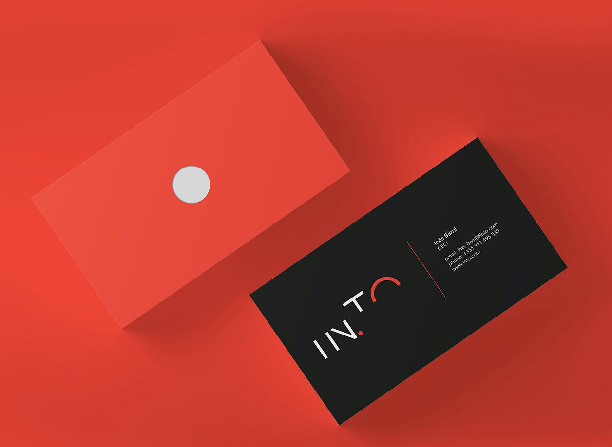
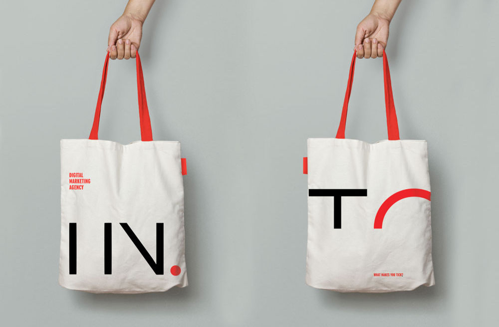
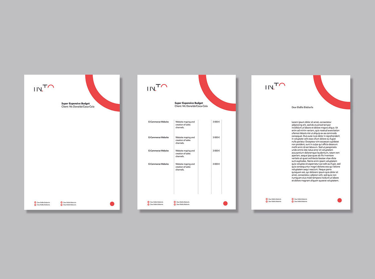
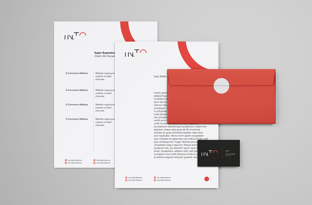
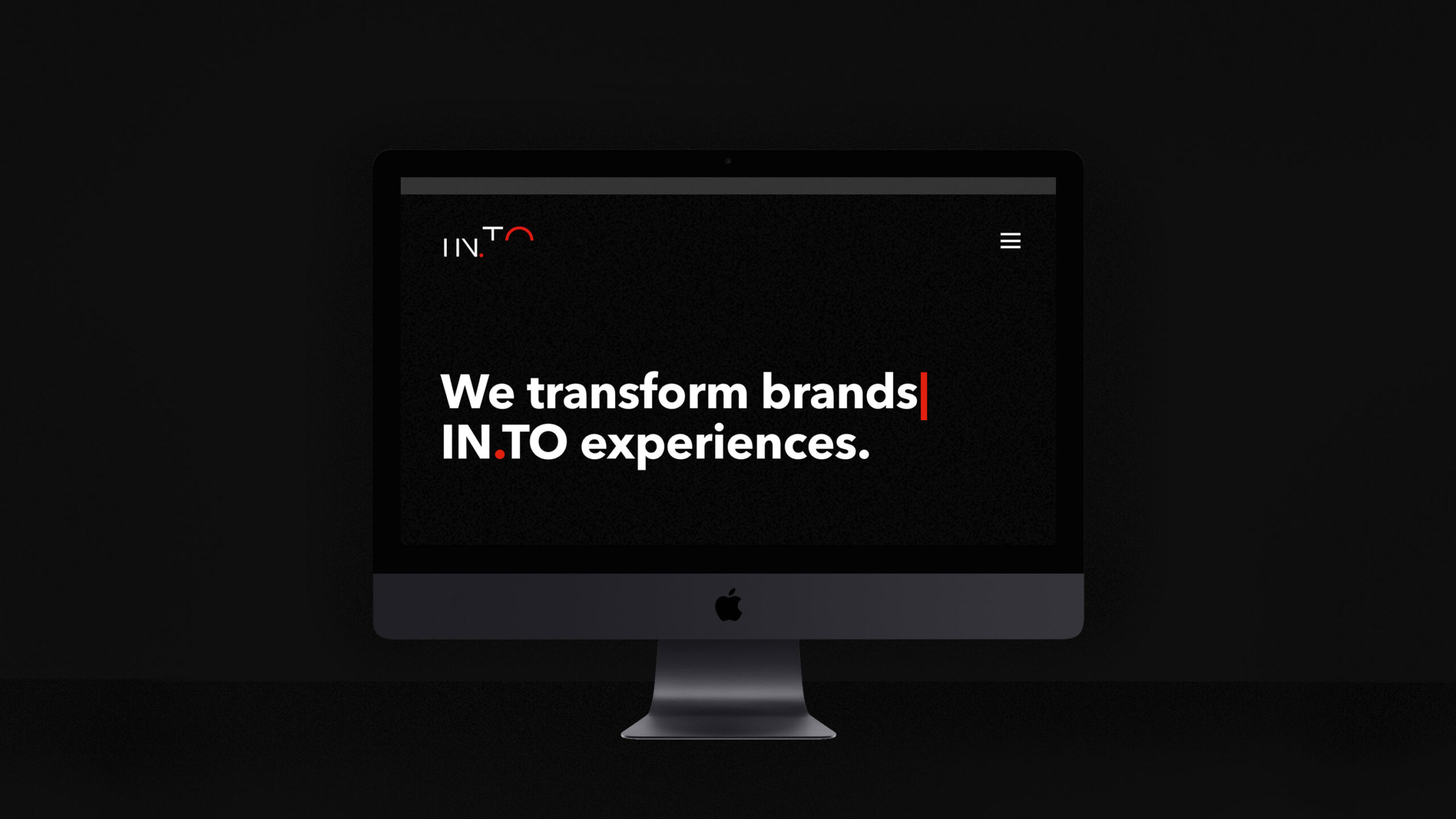
IN.TO
The identity for IN.TO was designed to mirror the agency’s core mission: guiding businesses through meaningful digital transformation. More than a name, IN.TO represents movement — into the future, into innovation, into new ways of working. The visual identity embraces this forward-thinking mindset, translating complex digital processes into a clear, adaptable, and contemporary visual language.
Date
February 2017
Role
Branding, Graphic Design
The Challenge
The challenge was to develop a brand identity that could balance two seemingly opposite forces: the strategic, data-driven side of digital transformation, and the human, intuitive element that drives real change. IN.TO needed to stand out in a competitive landscape while remaining approachable to companies at different stages of digital maturity. It was essential to create a system that could flex across a variety of services — from consulting and UX strategy to tech implementation — while maintaining a consistent and recognizable brand presence.

The Solution
We built the identity around the idea of connection and transition — using modular design, clean typography, and a dynamic logo system that reflects digital movement. The wordmark itself hints at a passage or gateway, reinforcing the notion of entering a new digital era.
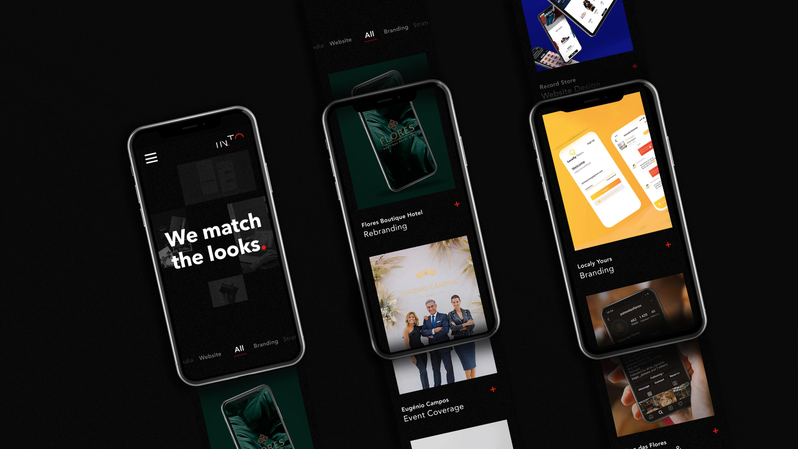
The visual system incorporates graphic patterns inspired by data flows, grids, and user interfaces, creating a sense of rhythm and structure. A refined color palette bridges the digital and corporate worlds, blending trust with innovation.
Together, these elements create a versatile and future-proof identity that positions IN.TO as a reliable partner for businesses navigating the evolving digital landscape — clear, confident, and always in motion.
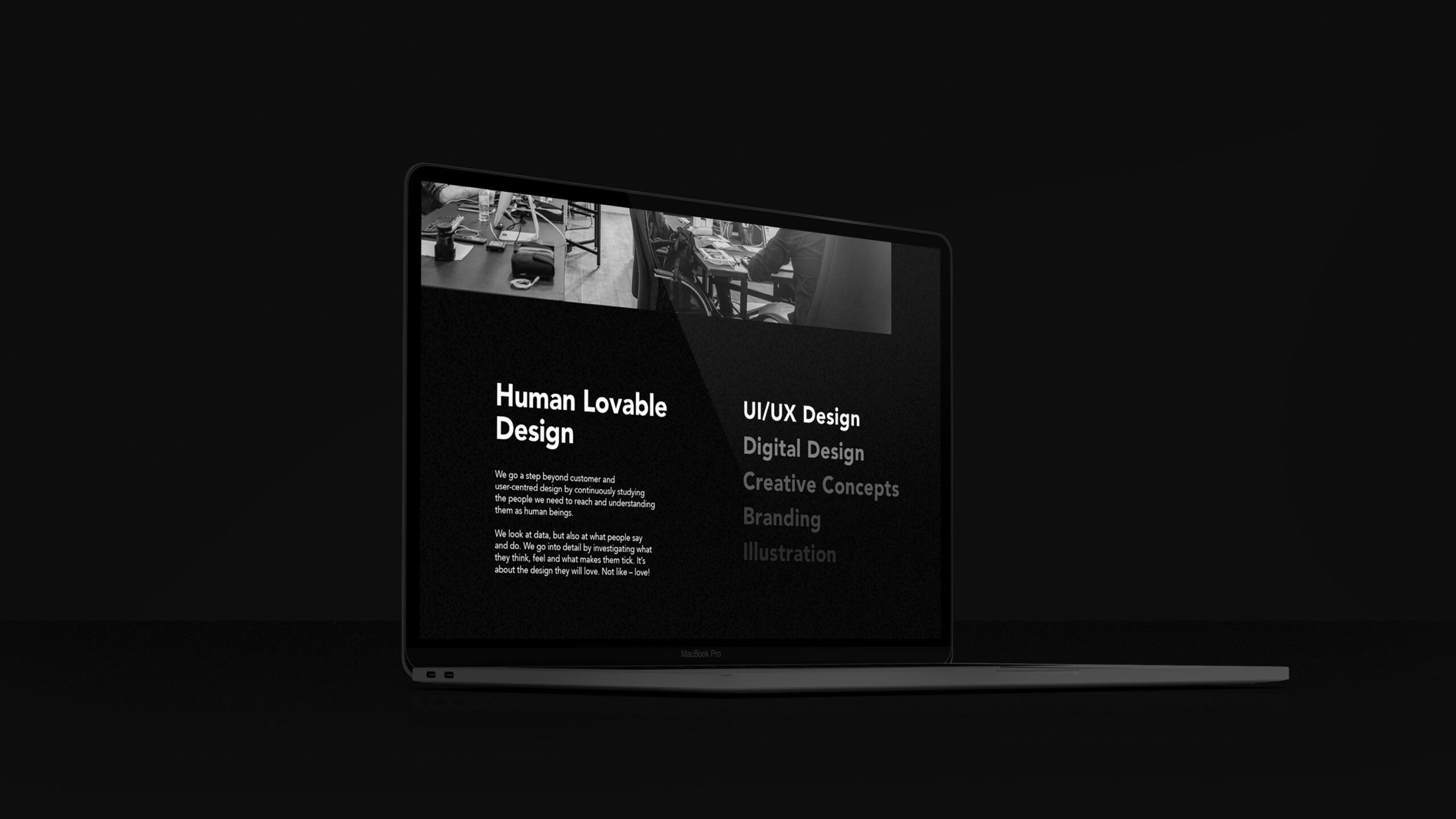
Digital transformation made human — intuitive, clear, and built for real impact.