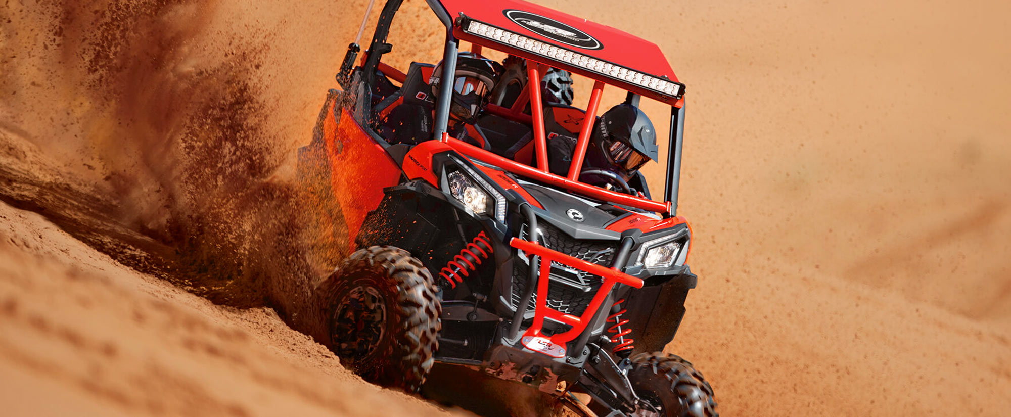
OPORTO Buggy
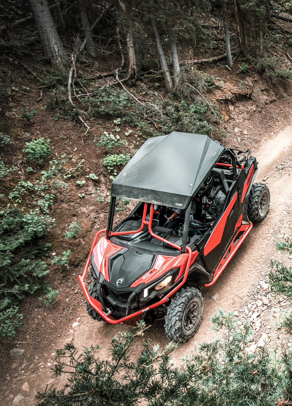
The identity created for Oporto Buggy captures the raw energy and sense of freedom that define the brand’s off-road adventures. Positioned at the intersection of adrenaline and nature, the visual concept was designed to reflect the rugged landscapes of northern Portugal and the thrill of exploring them behind the wheel. From buggies racing through the mountains to kayaking and other outdoor sports, Oporto Buggy stands for dynamic, authentic experiences in motion.
Date
November 2017
Role
Logo Design, Branding
<
The Challenge
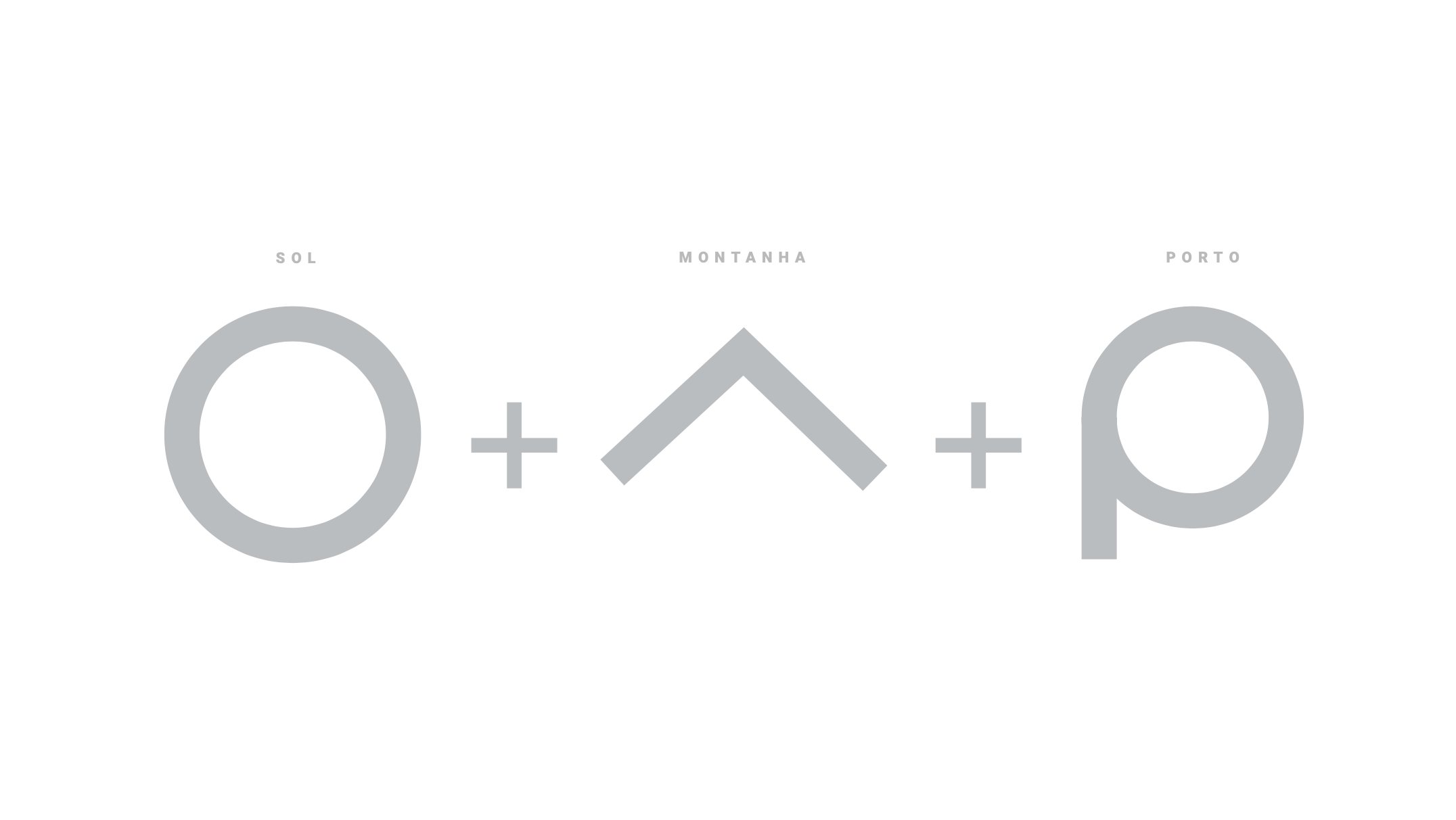
The main challenge was to build a visual identity that could communicate both the spirit of adventure and the professional, trustworthy nature of the brand. The name itself carries weight — “Oporto” rooting the brand in its region, and “Buggy” suggesting action and movement — and the design had to channel that same duality.
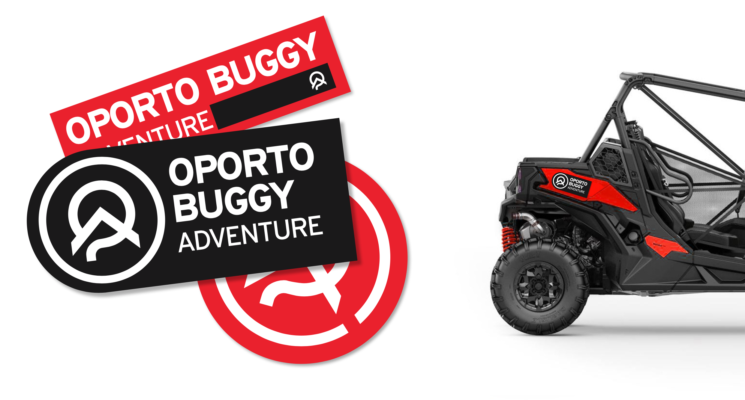
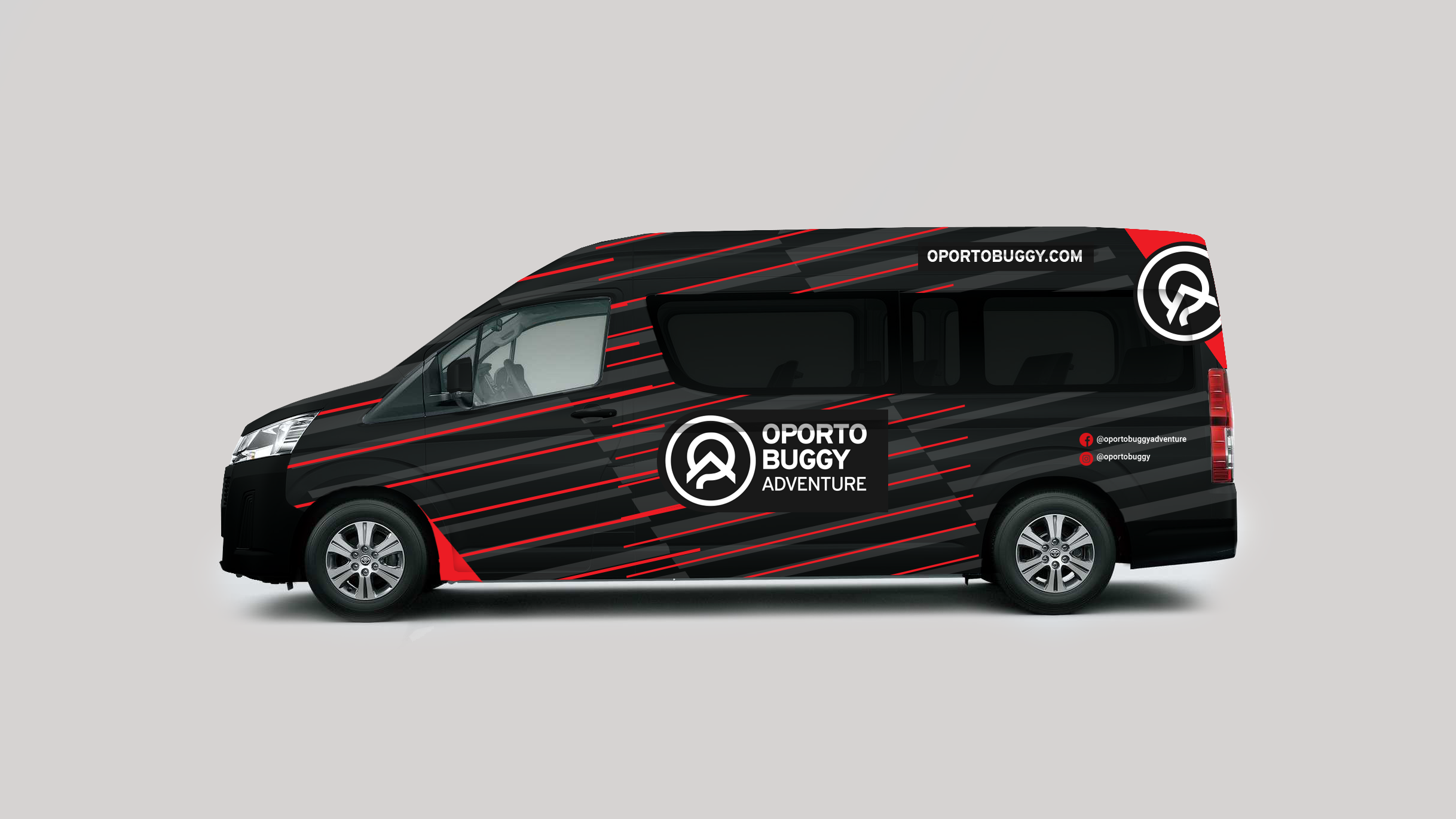
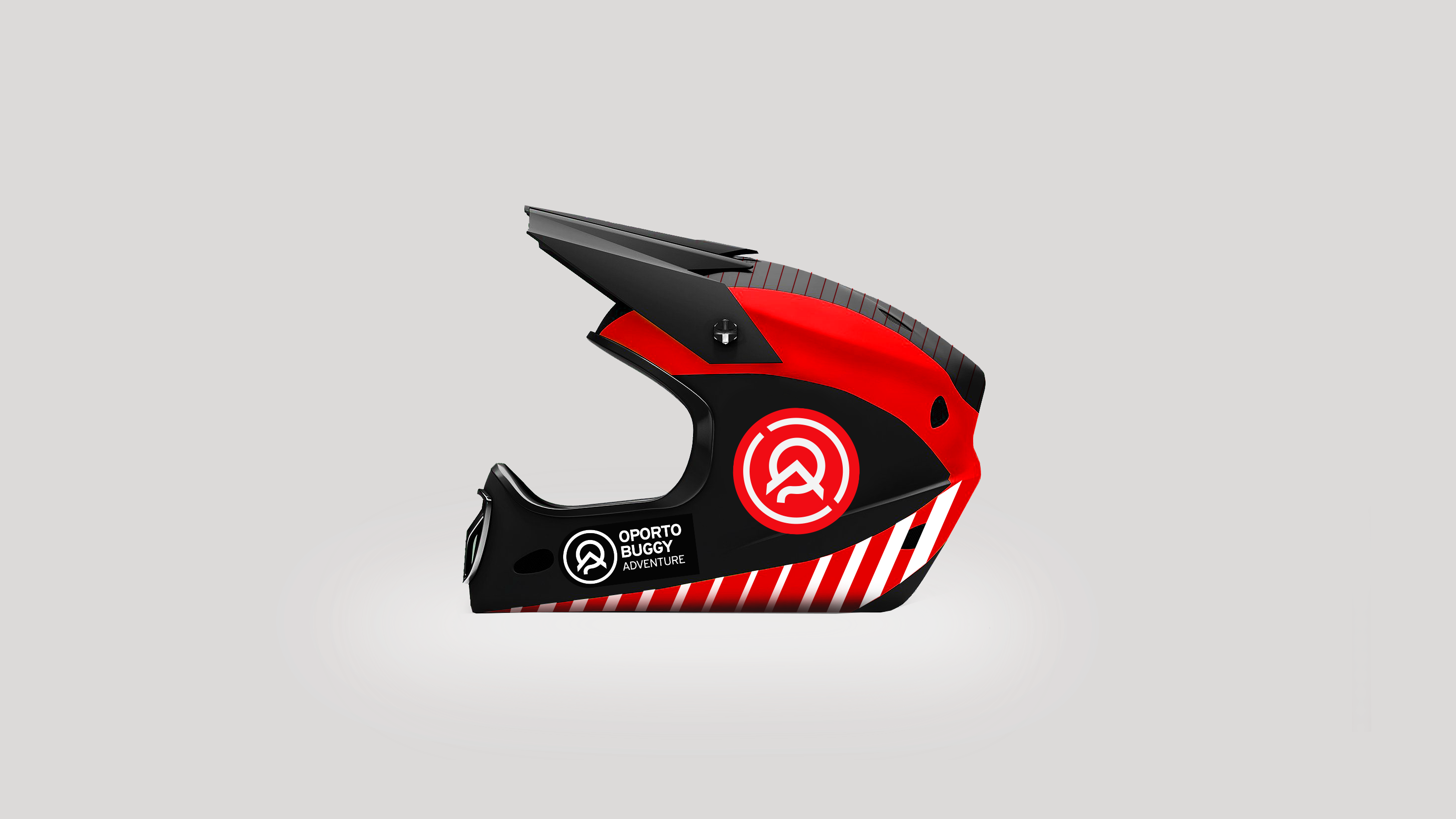
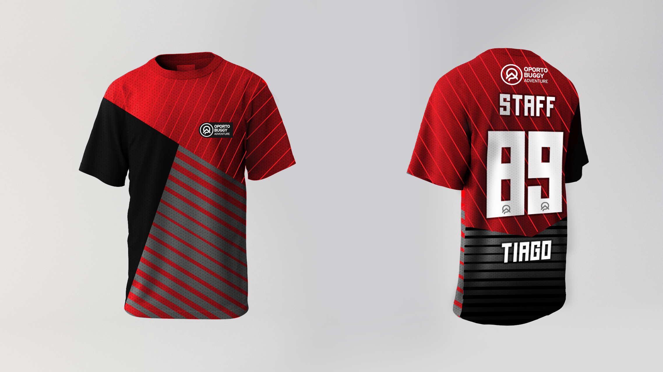
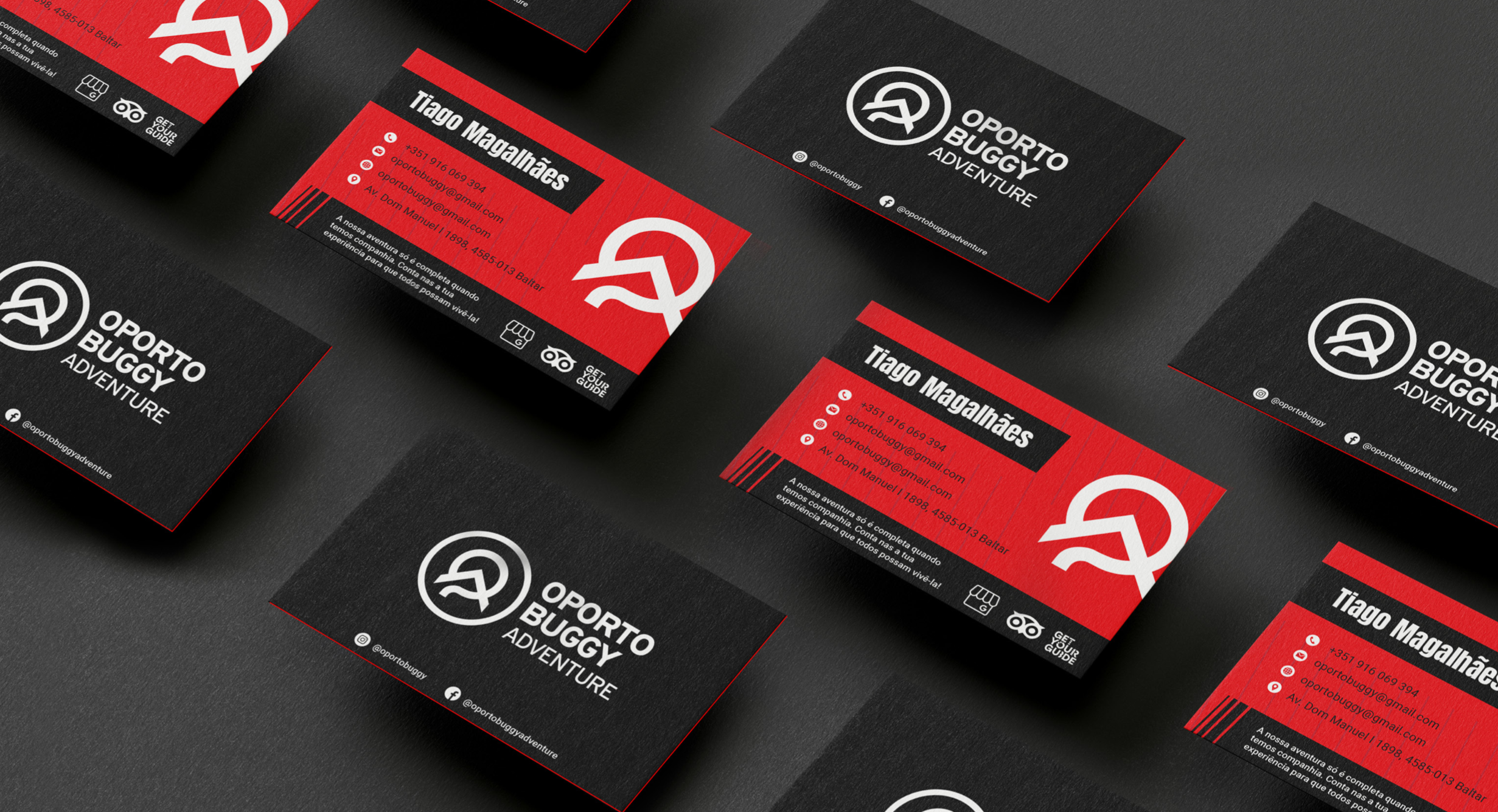
The goal was to create an identity bold enough to appeal to thrill-seekers, yet structured enough to function across a wide range of touchpoints: from digital platforms and vehicle signage to apparel, maps, and promotional content.
The Solution
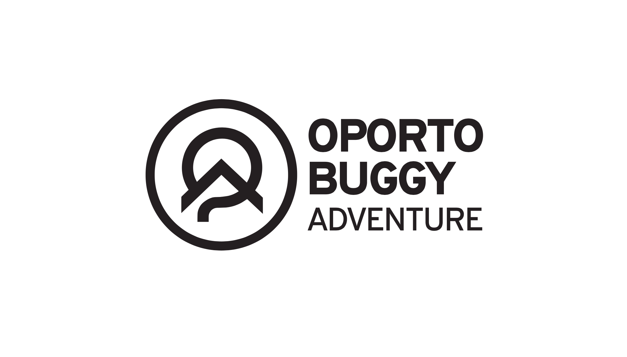
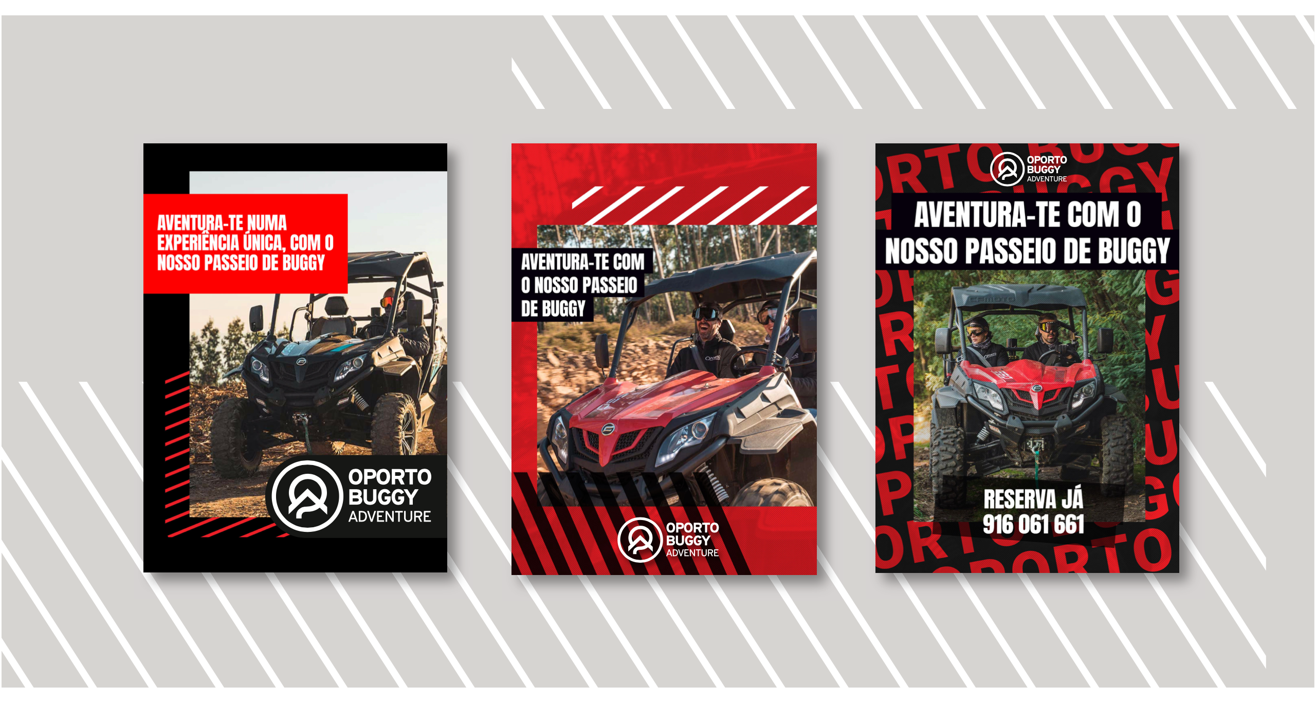
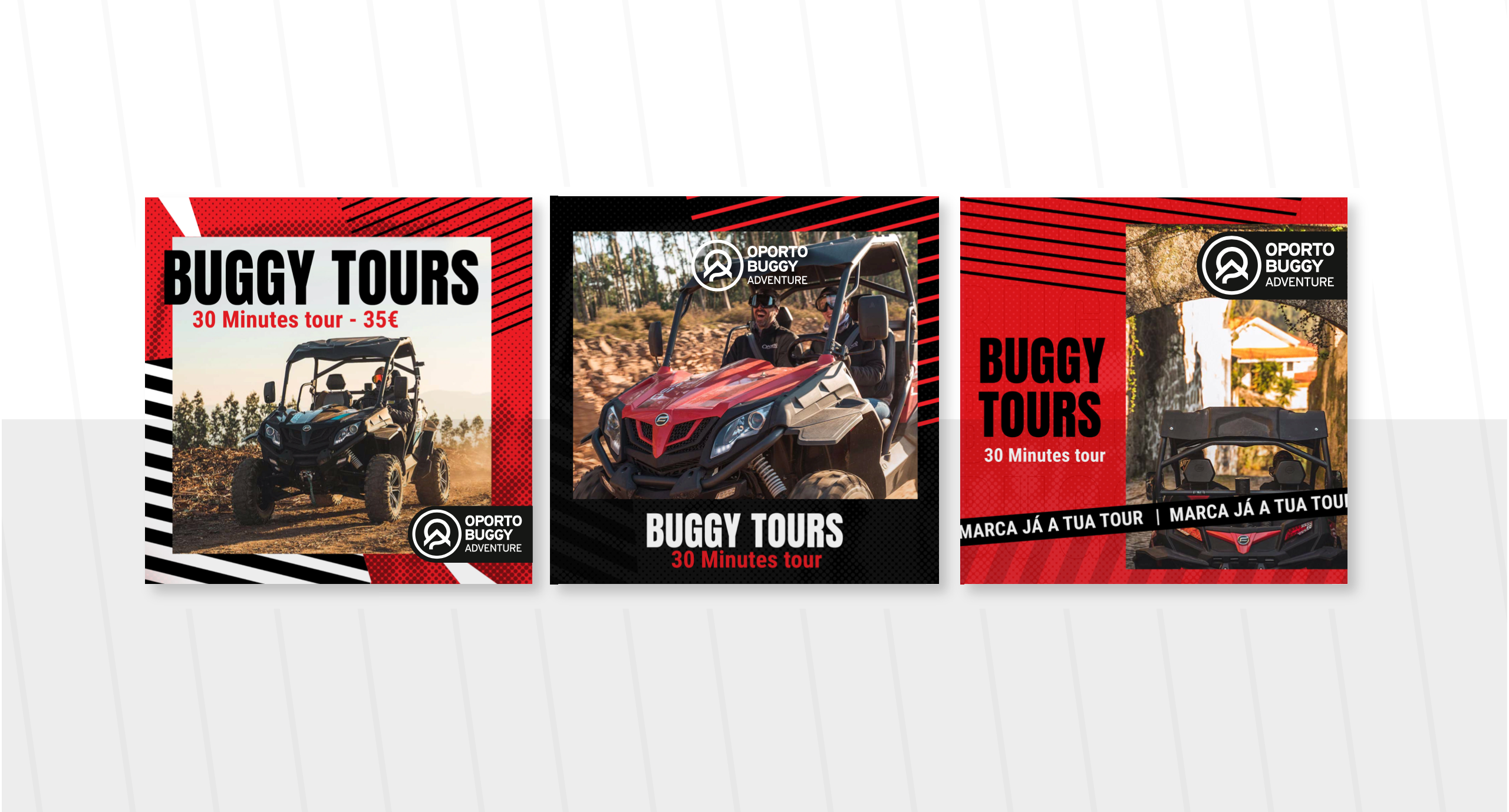
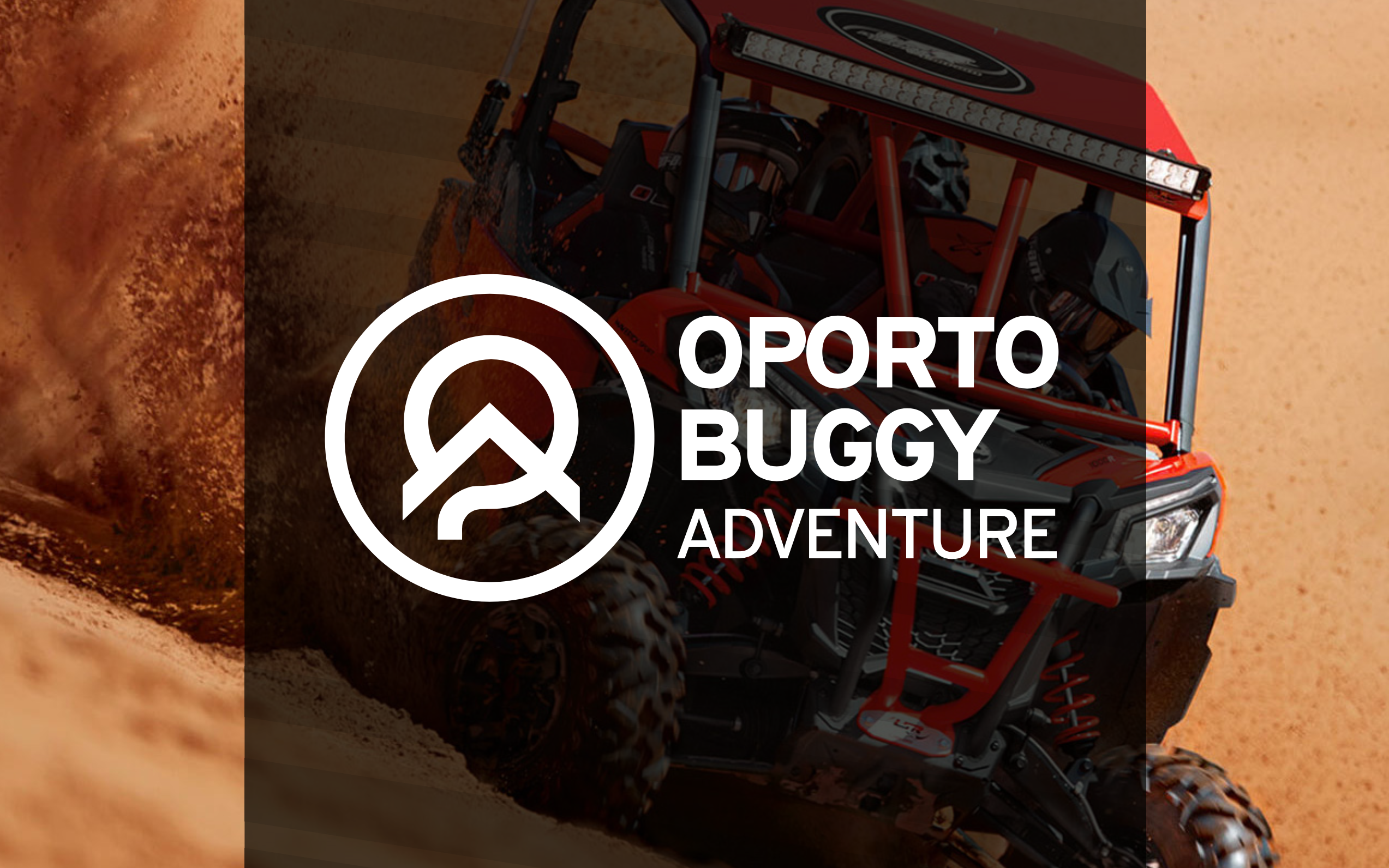
Inspired by tire tracks, terrain maps, and motion lines, the visual system brings together geometric strength and natural flow. The logo was designed to feel fast, bold, and grounded — using angular forms and a modular layout that adapts to different formats. A high-contrast color palette and strong typography evoke energy and clarity, making the brand instantly recognizable whether on a buggy speeding through dirt trails or on a mobile screen.
Additional graphic elements, like trail symbols and weathered textures, were developed to enrich the visual language and support the adventurous personality of the brand. The result is a cohesive identity that amplifies the Oporto Buggy experience — thrilling, immersive, and proudly rooted in the wild terrain of northern Portugal.