HO WINES
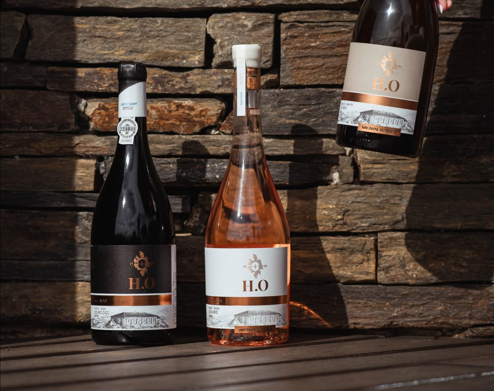
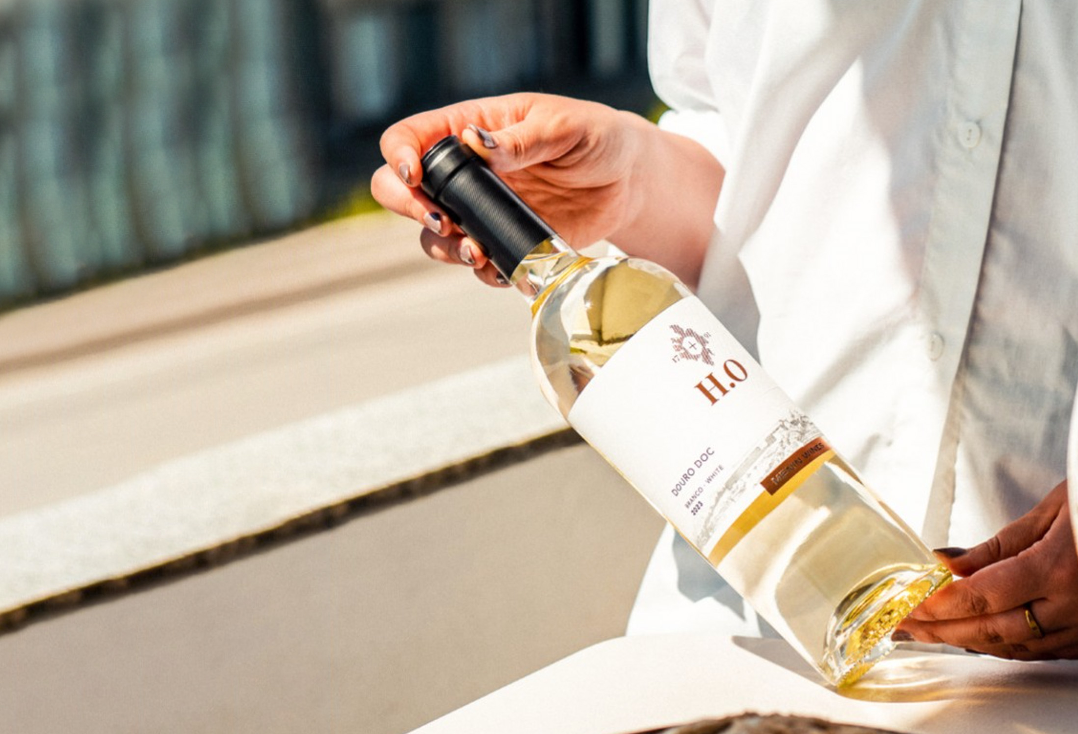
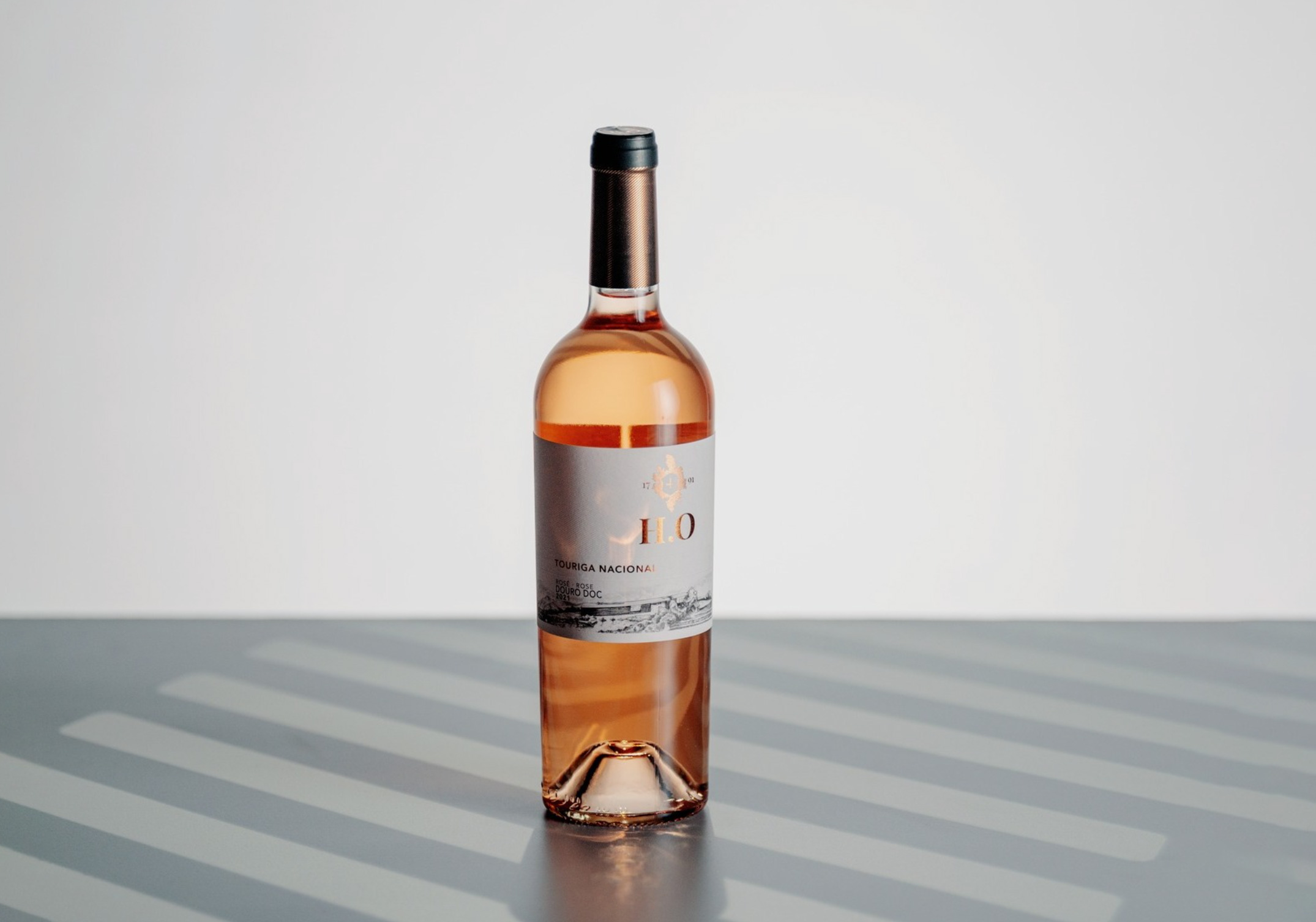
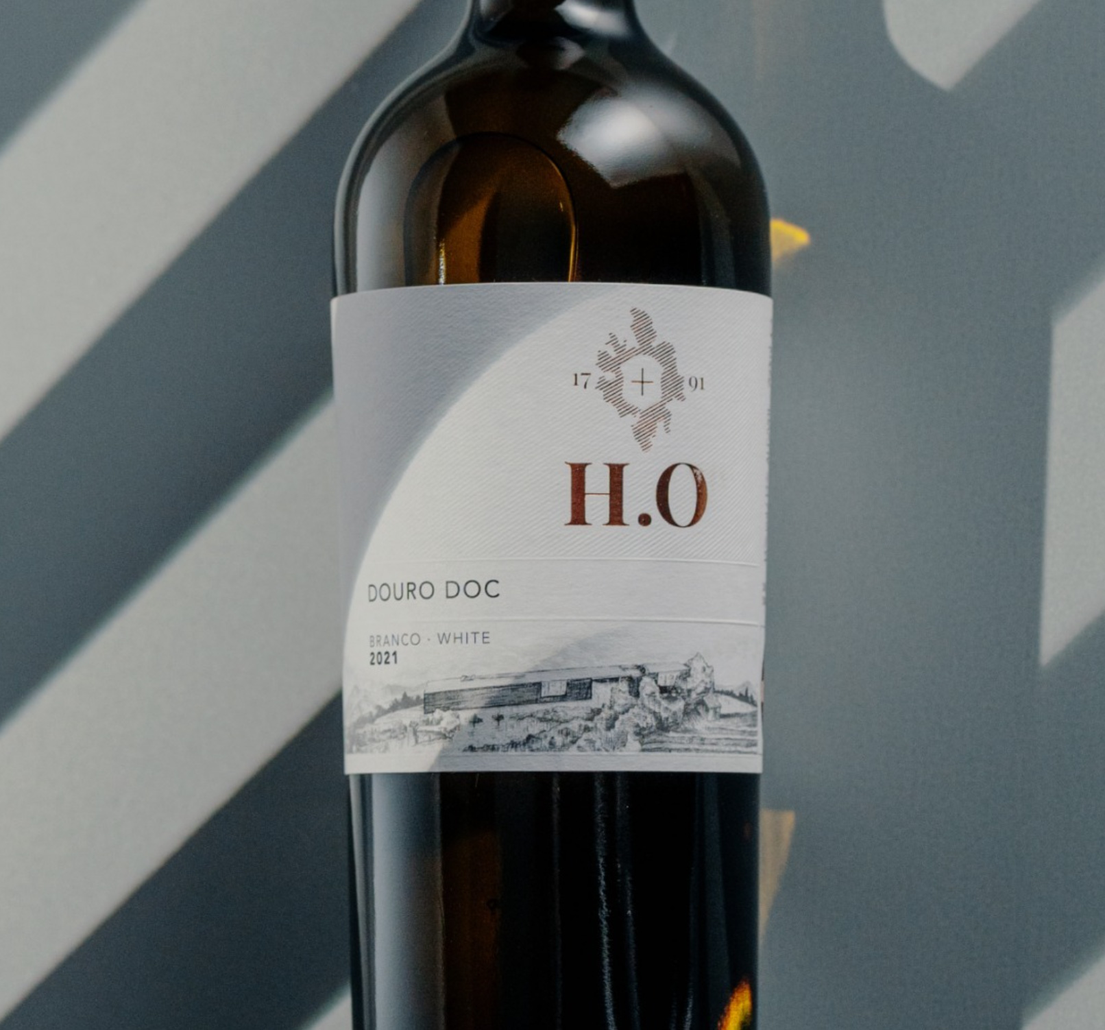
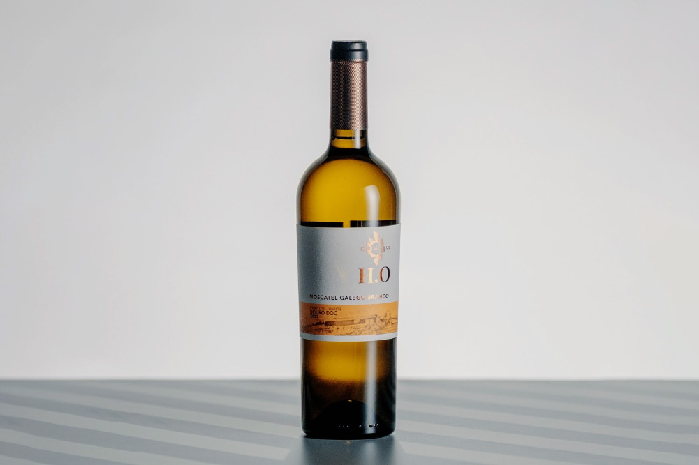
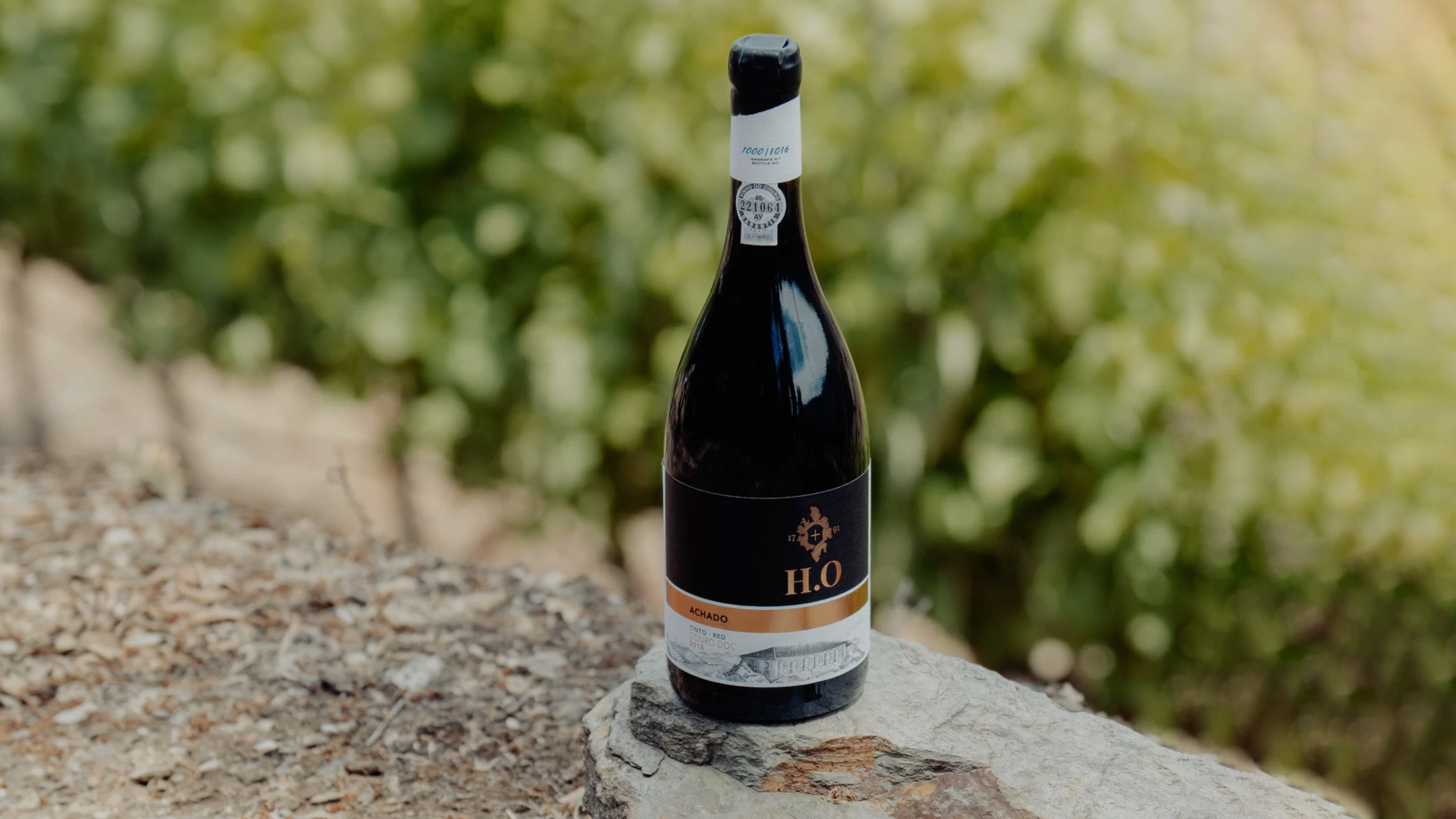
This project is a visual journey through heritage and mastery — a series of cross-hatching illustrations created for the full range of HO Wines. Drawing inspiration from the legacy and craftsmanship deeply rooted in the brand’s DNA, the illustrations were developed to evoke a timeless aesthetic, where every line speaks to tradition, precision, and care.
Date
January 2019
Role
Illustration, Graphic Design, Production
Credits to Omdesign and HO Wines.
The Challenge
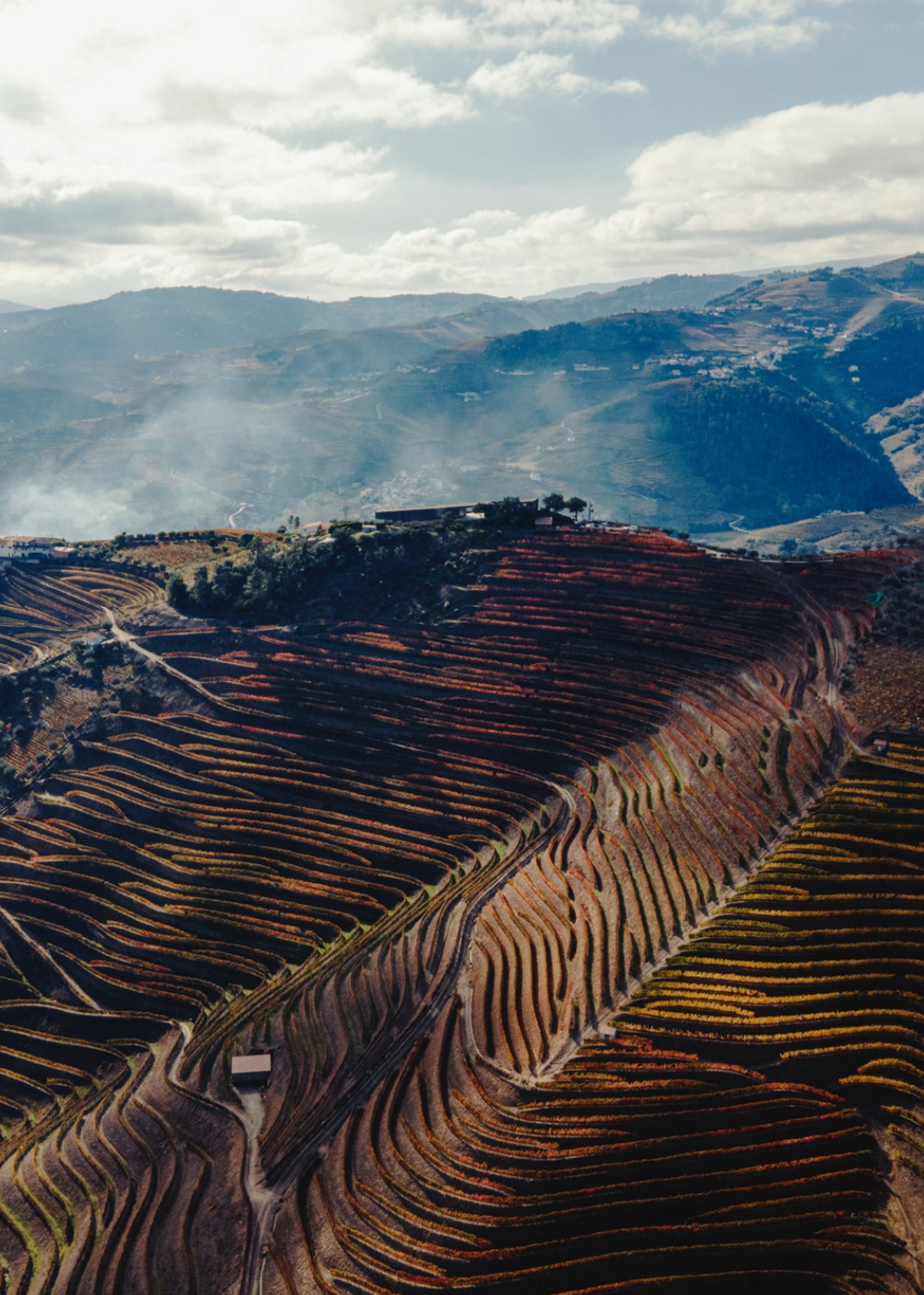
H.O. Wines is a distinguished winery located in the Douro Valley, Portugal, with a rich history dating back to 1791. Situated in the Lower Corgo sub-region of Santa Marta de Penaguião, the estate spans approximately 55 hectares, including around 10 hectares of traditional old vines. The vineyards are divided among several parcels, with Quinta do Pontão and Quinta dos Osórios being the most prominent.
The main challenge was to translate the soul of HO Wines into a visual language that could reflect both its heritage and its bold steps into the future.
On one hand, there was a need to honor the land — to capture the unique character of the vineyard’s surrounding landscape, filled with texture, elevation, and history.
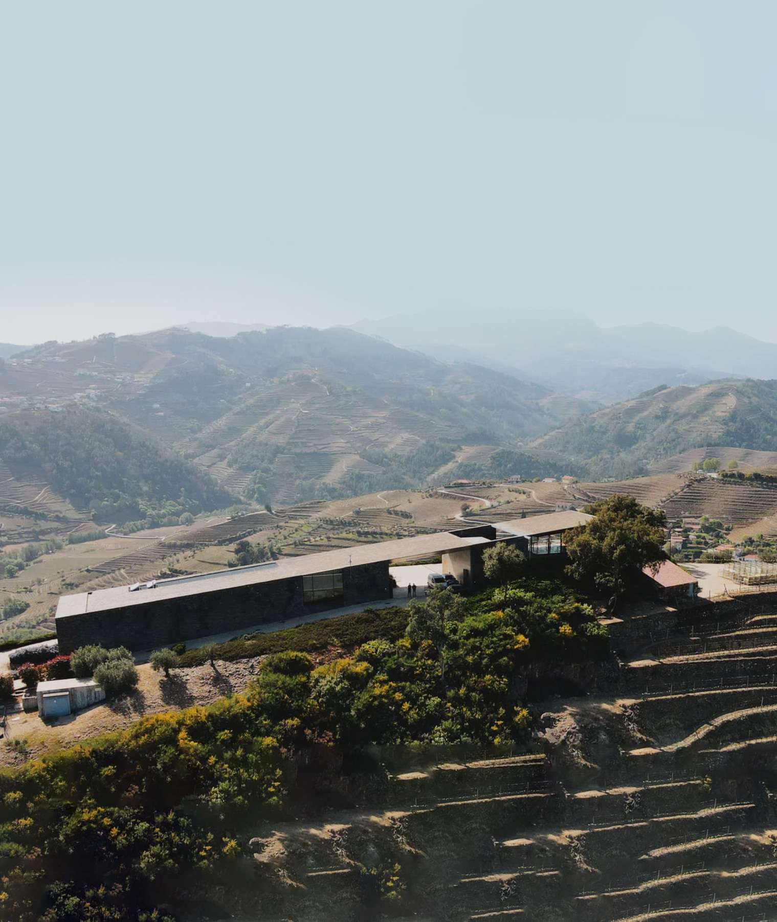
On the other, it was crucial to represent the new winery:
a contemporary architectural piece that marks a new
chapter for the brand.
A unique terroir of the Lower Corgo sub-region, where H.O Wines’ vineyards are nestled among the schist and granite
soils, benefiting from the microclimates shaped by the Marão mountain range.
Additionally, the illustrations needed to encapsulate the architectural elegance of the new winery—a structure that harmoniously blends with the natural contours of the land, offering panoramic views of the Douro and Serra do Marão.
The goal was to merge these elements into a unified visual language that honors the brand’s storied past while
embracing its forward-looking vision.
The Solution
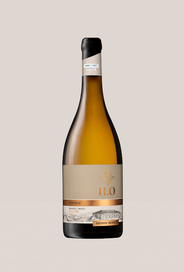
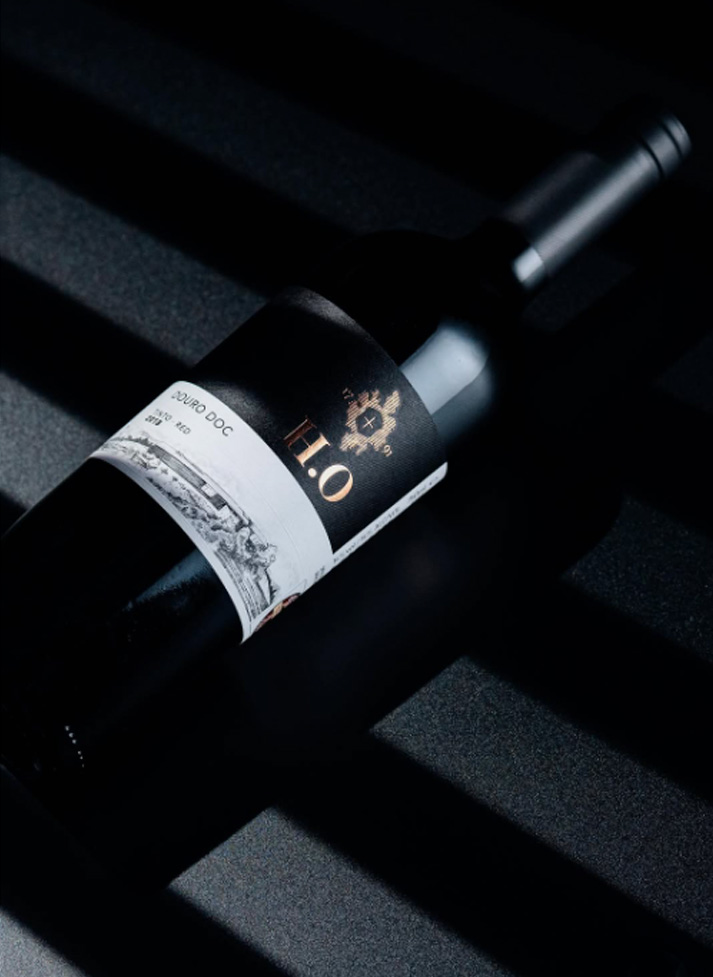
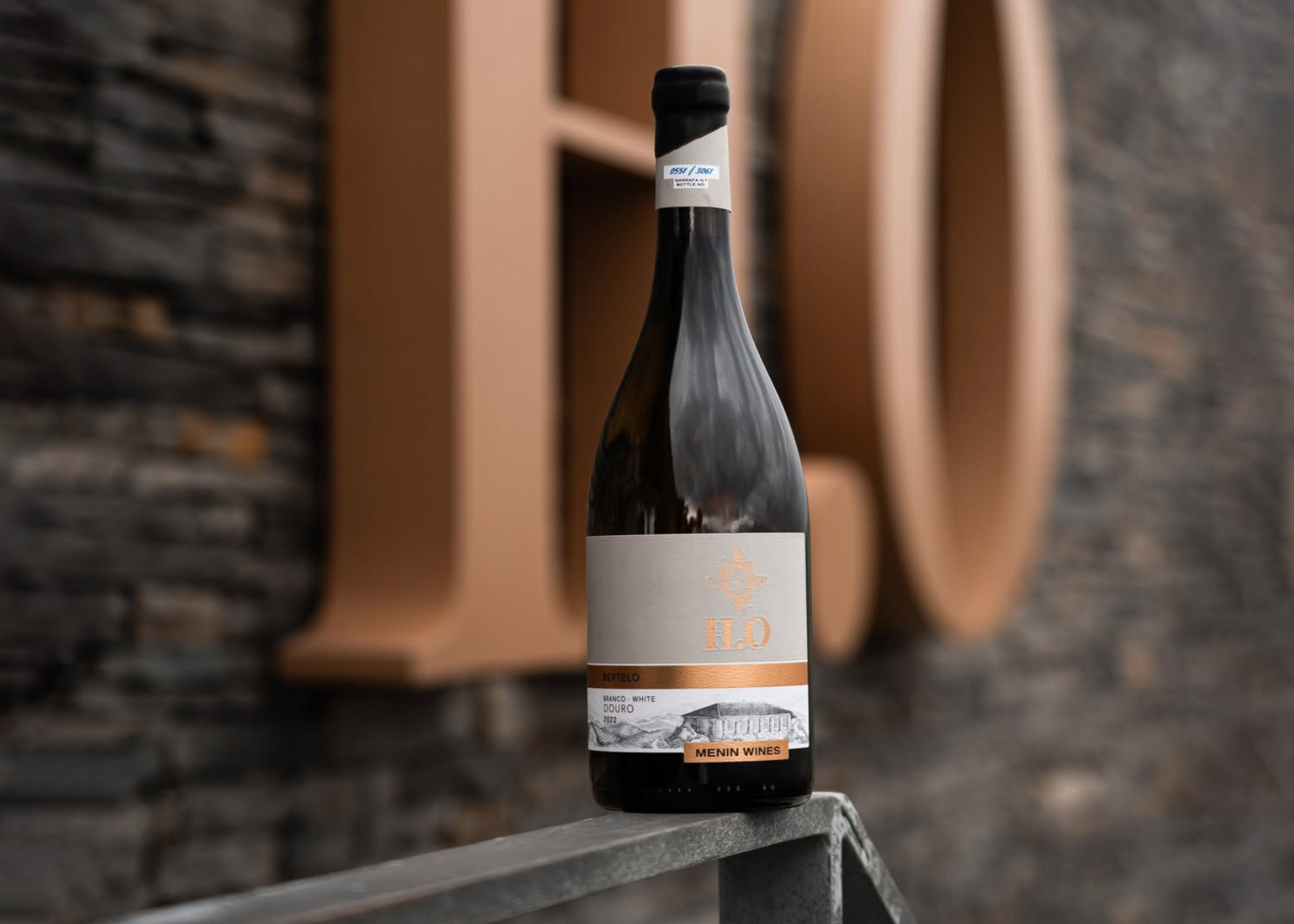
Utilizing the traditional technique of cross-hatching, each illustration was developed with precision to mirror the complexity and character of H.O Wines. The detailed line work conveys the texture of the vineyards and the architectural nuances of the winery, symbolizing the brand’s dedication to craftsmanship and innovation. This artistic approach not only reinforces the authenticity of H.O Wines but also creates a distinctive visual identity that resonates across all touchpoints, from the wine labels to the broader brand experience.