Project Power
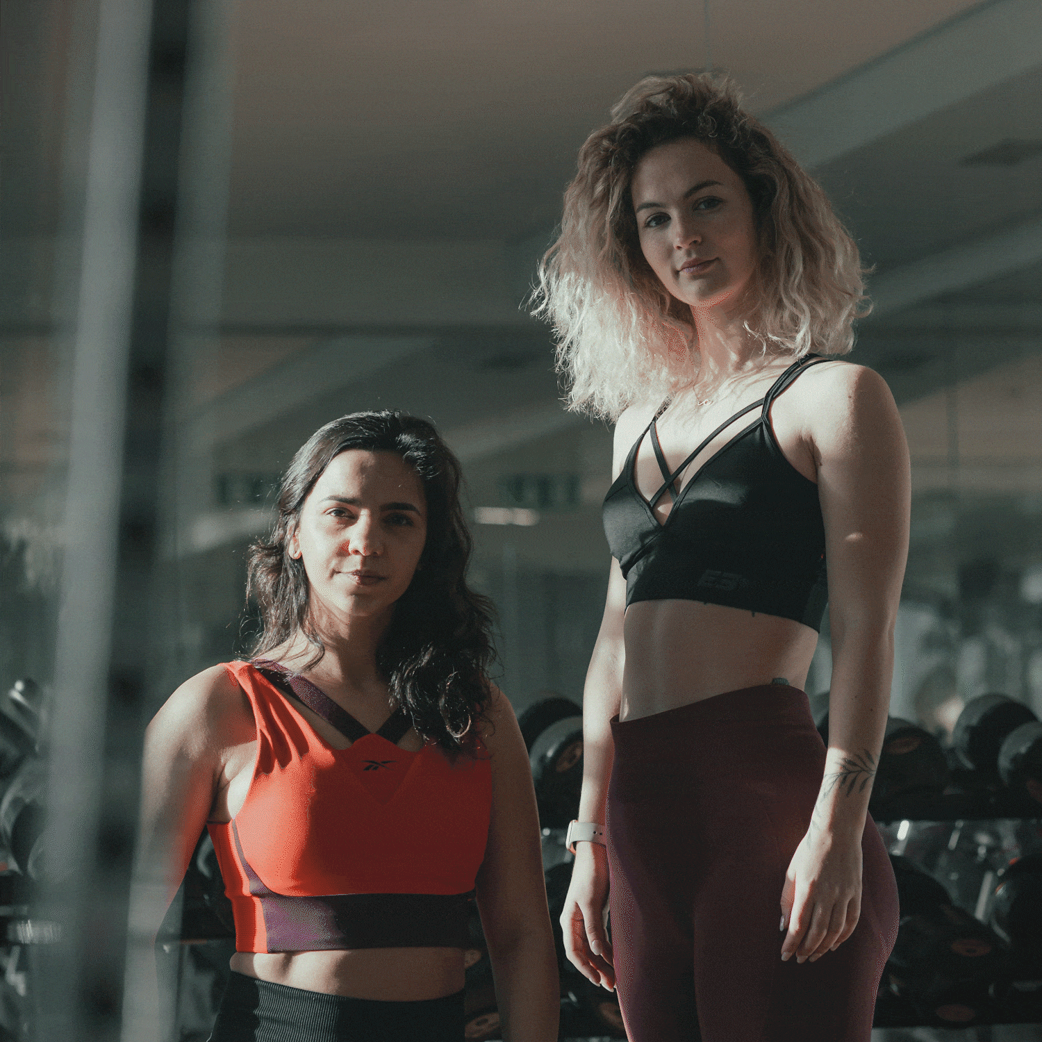
This project represents the creation of a visual identity that celebrates the balance between strength and harmony, designed for a fitness program and community that inspires women to train and connect with their bodies. The branding captures the essence of empowerment, while the website and social media extend that message, offering a platform for connection, motivation, and self-discovery.
Date
June 2021
Role
Brand Designer and Digital Strategist
The Challenge
The challenge was to design an identity that celebrated female empowerment without relying on clichés or overused visual codes. It had to communicate strength and energy, but also warmth and inclusivity — reflecting the dual spirit of discipline and sisterhood that defines the community. To do this, the process began with conversations with the founders and early users of the platform, understanding what motivated them and what they felt was missing from traditional fitness brands.
The Solution
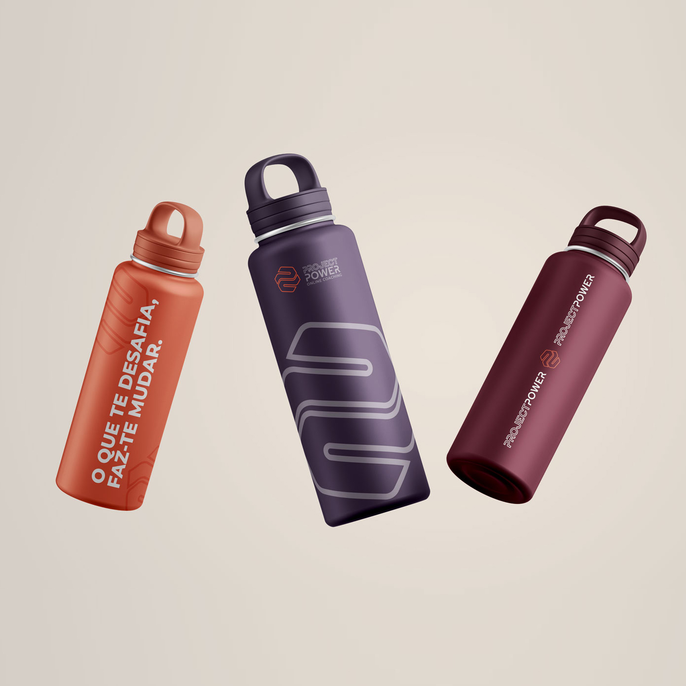
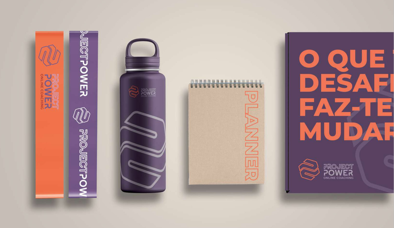
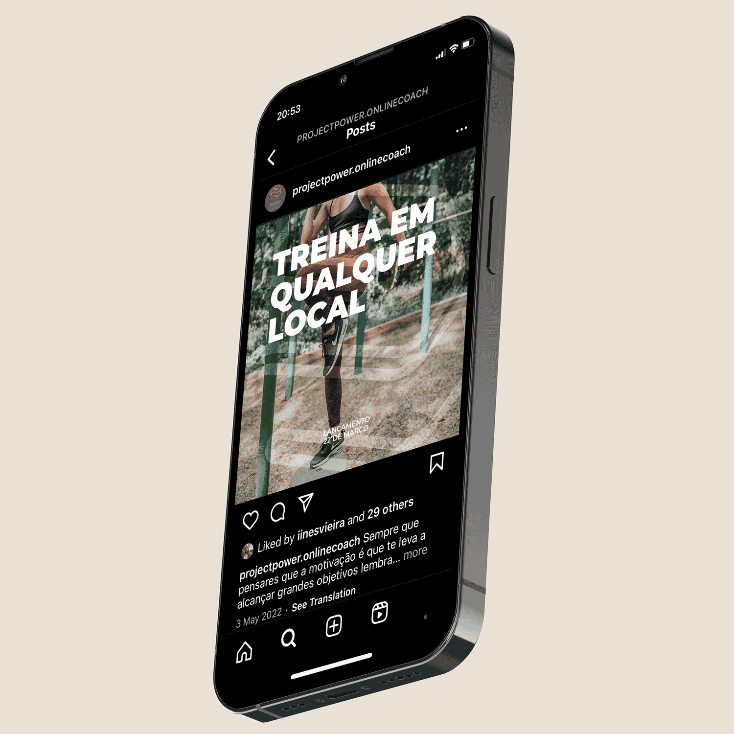
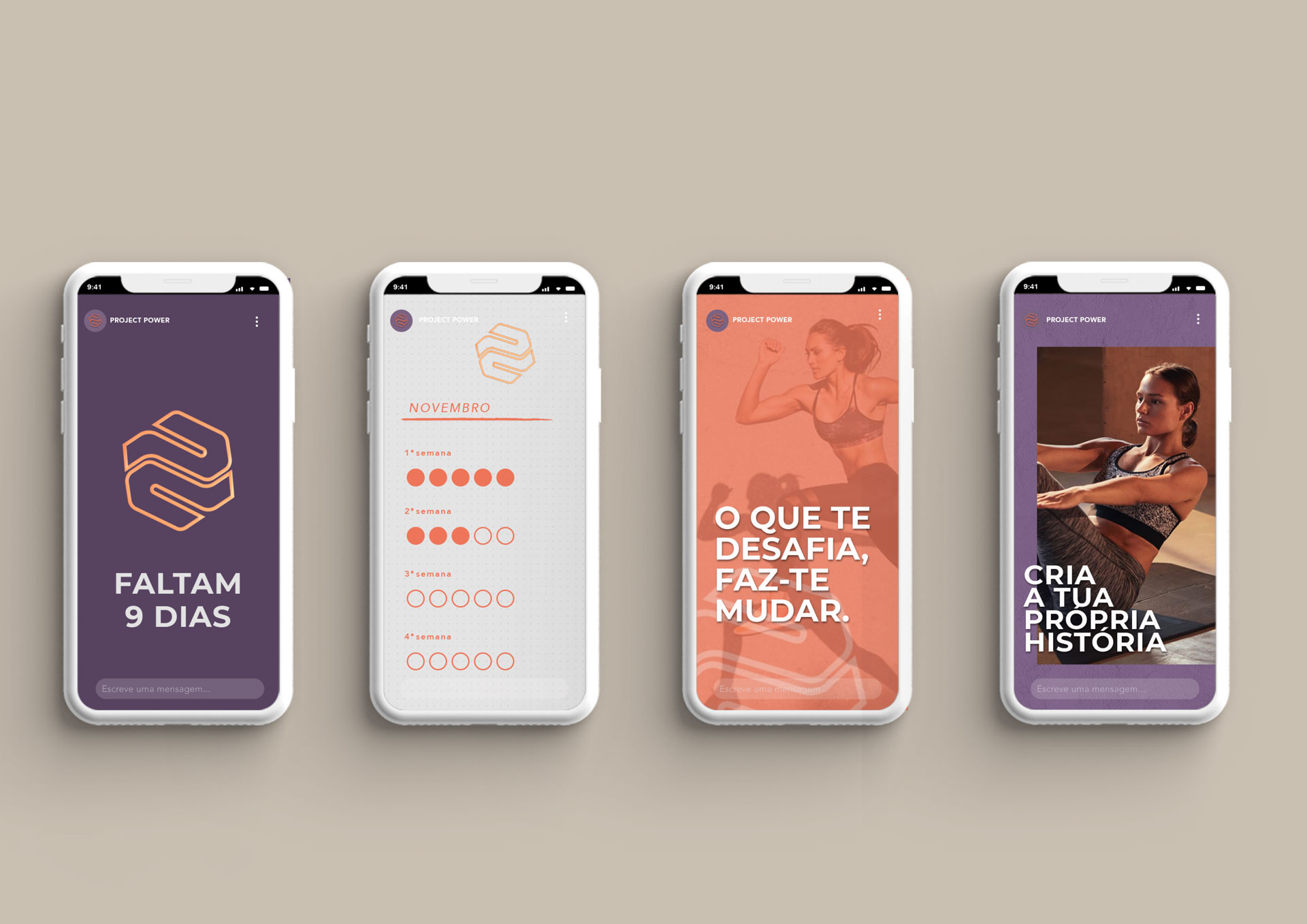
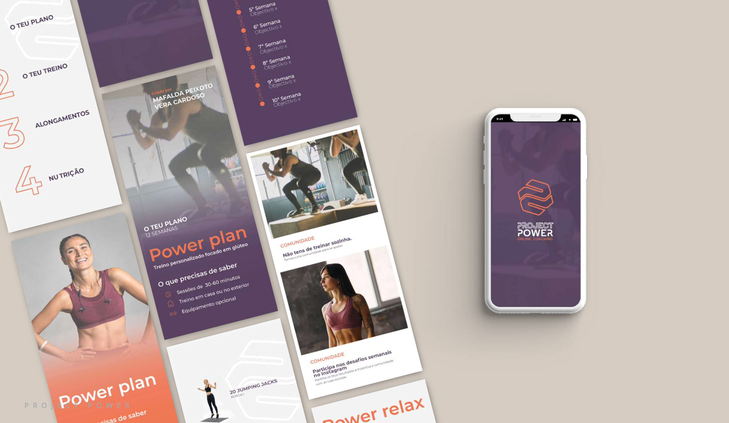
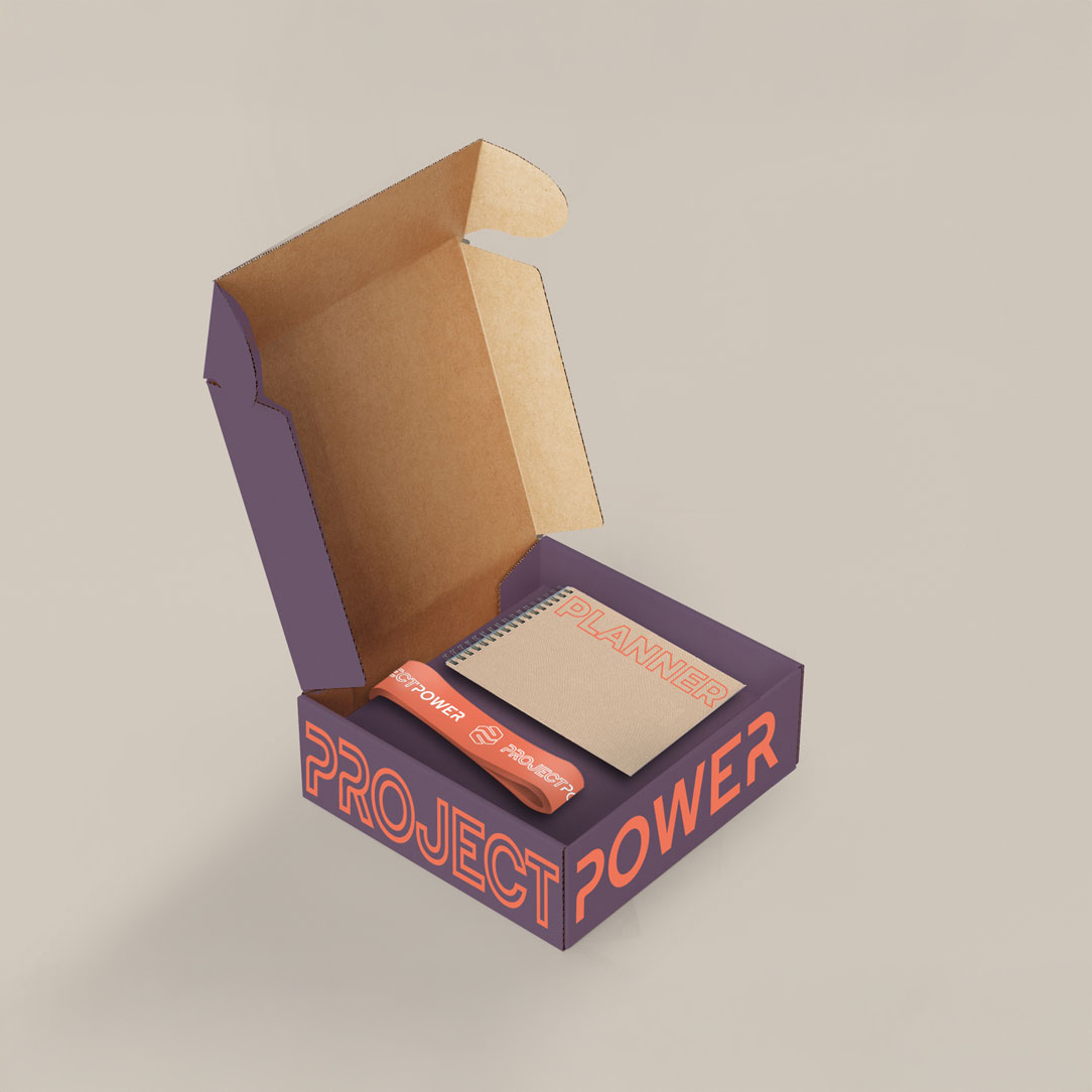
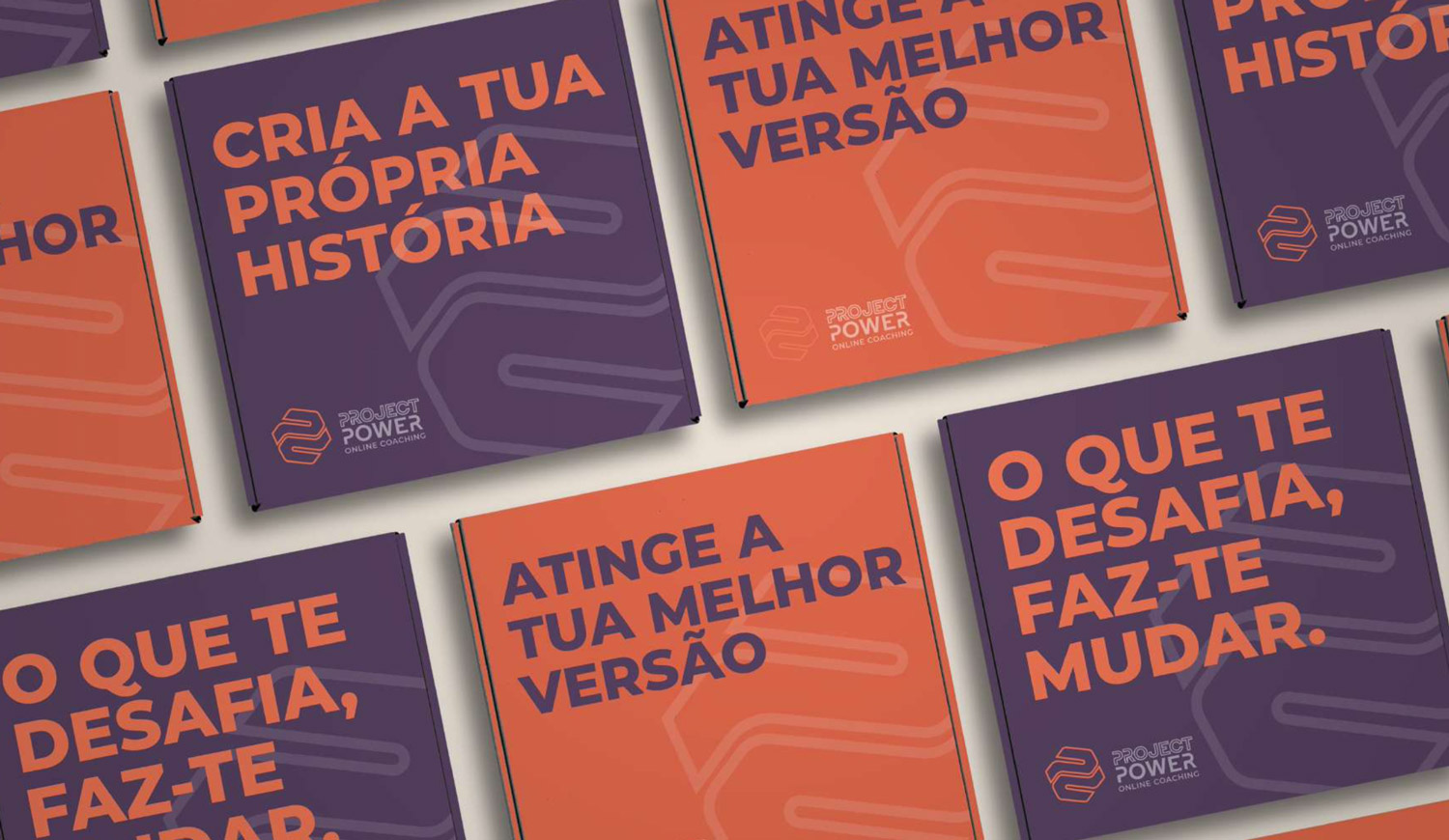
The visual identity draws on a bold typographic system — geometric yet fluid — symbolising resilience and adaptability. The colour palette combines energetic tones with earthy, grounding shades to reflect both the power and harmony at the core of the brand. Iconography and graphic elements echo progress, motion, and interconnectedness, reinforcing the idea of community-driven growth. Alongside the brand, a digital platform was developed to support training plans, progress tracking, and real-time support. The website serves as both an entry point and a hub, making the entire experience feel intentional, inspiring, and personal.
A transformative visual identity that empowers women through strength, harmony, and connection, seamlessly blending fitness, wellness, and community.